That should look precisely the same as this table (except the text may wrap at different points - the text should wrap to the right of the element):
| A run-in heading | And some text, which will flow around it in a pleasing way. Isn't that |
| wonderful? And some text, which will flow around it in a pleasing way. Isn't that wonderful? And some text, which will flow around it in a pleasing way. Isn't that wonderful? | |
That should look precisely the same as this (except the text may wrap at different points - the text should wrap to the float):
| And some text, which will flow around it in a pleasing way. Isn't that | A run-in heading |
| wonderful? And some text, which will flow around it in a pleasing way. Isn't that wonderful? And some text, which will flow around it in a pleasing way. Isn't that wonderful? | |
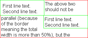
The following is:
<div style="float: left; width: 50%; border: solid 2px green">
First line text.
<br>
Second line text.
</div>
<div style="float: right; width: 50%; border: solid 2px green">
First line text.
<br>
Second line text.
</div>
<div style="border: solid thin red">
The above two elements should not be parallel (because of the
border meaning the total width is more than 50%), but should be
one on top of the other, with the content of this element wrapping to the right of the first one, and then to the left of the second one, but with its border overlapping them both.
</div>
Here's a mockup of the correct rendering:

The following is:
<div style="float: left; width: 50%; border: solid 2px green; background: red">
First line text.
<br>
Second line text.
</div>
<div style="float: right; margin-left: 5%; width: 45%; border: solid thin green; background: red">
First line text.
<br>
Second line text.
</div>
<div style="border: solid thin red; background: yellow">
The above two elements should be parallel with a combined width of 100%. As a result, this (red) border should only be visible where they are not (below the vertical level that they are on). In addition, the start of this text should be below the bottom of both elements. This should have a yellow background; they should have a red one.
</div>
 This text
|
This
|
In the example above, the bottom of the yellow 'This' should be level with the bottom of the blue 'text'.
Here's the code:
<table cellpadding=0 cellspacing=0>
<tr valign=top>
<td width=200 style="padding: 0">
<div style="font-size: 22px; line-height: 22px; text-align: right">
<img src="green.gif" vspace=0 width="200" height="52" style="float: left">
<span style="background: red">This text</span>
</div>
<td>
<div style="font-size: 22px; padding-top: 66px; line-height: 22px">
<span style="background: yellow">This
</div>
</table>
The reasoning is that the image is floated. This takes it out of the line box. However, it should be aligned with the top of the line box from which it was displaced. That line box also contains the text. Since the table cell is the same width as the image, there is no room in the first line box for the text to flow along side of it, and so the text is moved down to the next line box. Equally in the second box, there is no room for the text, so it is moved down again. It is now 44 pixels down. Again, there is no room next to the image since the image is 52 pixels high, so a third line box is created. This is 66 pixels down. As a result, in the next table cell a top padding of 66 pixels is required to align the yellow text with the red text.
|
|
This text |
The above two elements should not have their lines of text parallel.
The code here is the same as before with the exception that the element now has a top padding of 52 pixels, which is what browsers are likely to do with the content - place it below the image. This is incorrect because of the case where some text can fit and some cannot - in this case the text should flow like this:
+----+-+
|IMG |x| Line box 1
|    |-+
+----+x| Line box 2
+----+-+
|xxxxxx| Line box 3
+------+
rather than like this:
+----+-+
|IMG |x| Line box 1
|    |-+
+----+x| Line box 2
|xxxx+-+
+------+ Line box 3
and the case where the text does this immediately is no different.
The horizontal rule should overlap with the float in the same way that other borders have done - it should 'underlap' the float, being visible where it overlaps it but placed below content of the float (the borders and content of the float should be on top of it, so it shouldn't be visible where these are.
Copyright © RichInStyle.com 2000; all rights reserved. See copyright document for terms of use. Please visit Bukit Lawang flood appeal.